By Sarah Kramer
Color schemes and fonts are critical elements in web design, significantly influencing user experience and brand identity.
By carefully selecting the right colors and fonts, designers can create a cohesive visual language that connects with the target audience, increasing engagement and reinforcing the brand’s distinct personality and values.
Discover the transformative impact of colors and fonts on your branding and website as you delve into the fascinating insights below.
Gain a deeper understanding of how these visual elements can shape perceptions, evoke emotions, and create a captivating online presence.
Tips for Choosing the Right Color Scheme for Your Website
Understanding Color Psychology
Color schemes for websites are not just about aesthetics; they play a crucial role in conveying a brand’s personality and connecting with its audience.
Colors have the power to evoke specific emotions and perceptions, influencing how visitors feel when they interact with a website.
This phenomenon, known as color psychology, underscores the importance of making informed choices when selecting colors for your website’s color scheme.
Explore the following spectrum of color options, each carrying distinct meanings and evoking specific feelings:
- Red: Red is a bold color that exudes excitement, strength, love, energy, passion, and even anger. It signifies action, power, courage, and danger, making it a popular choice for accents that grab attention.
- Orange: Orange is a vibrant color that exudes confidence, success, bravery, and sociability, creating a positive and energetic atmosphere. It ignites creativity, adventure, and enthusiasm while evoking a sense of warmth and happiness.
- Yellow: Yellow is a color closely associated with creativity, happiness, warmth, cheer, and optimism. It is reminiscent of summer and evokes a sense of warmth. Utilizing yellow can effectively draw attention to new products or inspire innovative ideas, as exemplified by the iconic Post-it notes.
- Green: The color green embodies the beauty of nature, evoking feelings of healing, freshness, and peace; it symbolizes growth, balance, and good health. Additionally, green is often associated with wealth and money.
- Blue: Blue inspires trust, peace, loyalty, and a sense of competence and integrity. In contrast to red, it has a calming effect that reduces tension, making it a favored choice. It is also one of the most prevalent colors used in marketing strategies.
- Purple: Purple exudes an air of royalty, luxury, spirituality, ambition, power, influence, and wisdom. It is associated with nobility and can evoke feelings of both frustration and arrogance. Purple is frequently employed to signify a high-quality or superior product, adding an element of prestige to its allure.
Understanding the principles of color psychology empowers you to craft a visually appealing website that deeply resonates with your visitors.
By strategically aligning the colors with your website’s purpose and target audience, you can create a powerful and engaging experience that elicits the desired response, whether it’s excitement, trust, or a sense of calmness.
Selecting an Effective Color Scheme
Selecting an effective color scheme for your website involves color theory basics and understanding how to utilize harmonious color combinations.
Color theory, a fundamental principle in art and design, explores the visual and emotional impact of colors by examining their interactions and effects on human perception.
The color wheel, a vital tool in color theory, is a circular diagram that organizes colors based on their relationships and helps visualize color combinations.
It consists of primary colors (red, blue, and yellow) as the fundamental building blocks, secondary colors (orange, green, and purple) created by mixing two primary colors, and tertiary colors formed by blending a primary color with an adjacent secondary color.
Color theory encompasses concepts like hue, saturation, and value that define the properties and variations of colors.
When selecting a brand color scheme, it’s crucial to consider warm, cool, and neutral colors.
Warm colors like reds, yellows, and oranges evoke energy and positivity, while cool colors such as blues and greens create a calm and trustworthy atmosphere.
Neutral colors like grays and browns offer a sleek and versatile backdrop that lets other design elements shine.
By choosing the right combination of colors, you can effectively convey the desired mood and align your brand’s visual identity with its values.
For a brief description of different color schemes, look below:
- Analogous – An analogous color scheme is composed of colors that are next to each other on the color wheel. Ex. Green and blue.
- Monochromatic – A monochromatic color scheme involves using different shades, tints, and tones of a single color. Ex. Shades of purple: lilac, royal purple, violet.
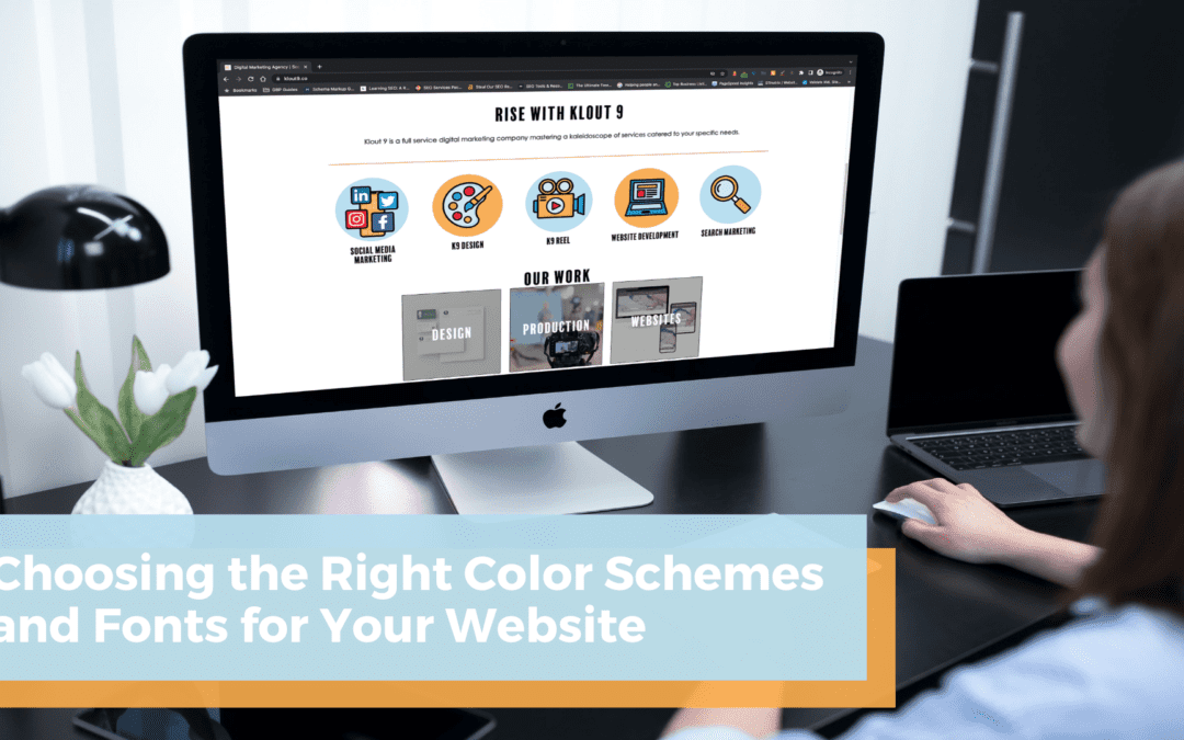
- Complementary – A complementary color scheme involves pairing colors that are opposite each other on the color wheel, resulting in a vibrant and dynamic visual contrast. Ex. Blue and orange, like Klout 9!
- Triadic – A triadic color scheme involves selecting three colors that are evenly spaced around the color wheel, creating a vibrant and balanced combination with a high level of contrast. Ex. Red, yellow, and blue.
- Compound – A compound color scheme combines two complementary color pairs. Ex. Red and green + yellow and purple.
Experiment with different combinations, consider the psychological associations of colors, and ensure the chosen color scheme aligns with your brand’s personality to create a visually appealing and meaningful user experience.
Strategies to Determine the Best Font for Your Website
Typography is essential for a website’s aesthetics, as the right font selection is vital for visual appeal and readability.
By exploring combinations between font categories like serif, sans serif, and script, designers can create standout website designs that balance aesthetics and functionality by considering factors such as font size, spacing, and readability.
Typography comprises three main styles: serif, sans serif, and script. In the realm of print publishing, fonts with serifs, such as the famous Times New Roman, are frequently favored due to their notable decorative strokes.
In contrast, sans serif fonts like Helvetica offer a clean and streamlined look by omitting these characteristic strokes.
Lastly, script fonts exhibit a handwritten or calligraphy-like appearance, exuding elegance and fluidity in their letterforms.
Combine Different Font Styles
Combining different font styles in web design can greatly enhance the visual appeal and user experience.
By leveraging the distinct characteristics of each font style, designers can create a harmonious and dynamic composition that adds visual interest, promotes readability, and reinforces the overall brand identity of the website.
When combining font styles, it is essential to strike a harmonious balance between contrasting and complimentary typefaces to create visual interest and hierarchy.
For instance, using a serif font for body text can enhance readability, while incorporating a decorative serif or script font for headings can add visual flair.
However, to maintain a cohesive and professional appearance, it is generally advisable to limit the number of fonts used on a website to a maximum of three and ensure they work together harmoniously.
Choose Large Font Families
When picking fonts, it is recommended to select a large font family that offers a wide range of styles and variations.
Large font families provide a range of options, including bold, semi-bold, normal, light, and more, making them highly versatile for various design applications.
This ensures consistent branding across different elements of the website. With a plethora of options, designers can maintain consistency and adapt the font to different contexts and devices, ensuring a seamless and engaging user experience across various platforms.
Prioritize Readability Across Platforms
In web design, font readability plays a crucial role, and it is vital to choose a font or font family that remains applicable across multiple platforms and devices, with a particular focus on mobile compatibility.
With the diverse range of devices used to access websites, including smartphones and tablets, it is essential to select fonts that maintain their legibility and clarity even on smaller screens.
Fonts that offer good readability on mobile devices contribute to a seamless user experience and ensure that visitors can effortlessly consume content without straining their eyes or encountering difficulties in reading.
Consider the font family’s scalability and adaptability to different screen sizes and resolutions.
Fonts that retain their visual appeal and legibility when scaled down on mobile devices are key to preserving the intended design and maintaining readability.
Likewise, choose a font or font family that is optimized for web and mobile use, as they are specifically designed to display well and provide consistent readability, making them ideal choices for web design that prioritizes accessibility and user-friendly experiences.
For body text and large quantities of text, a sans serif font is often the preferred choice due to its simplicity and ease of reading.
Additionally, incorporating a unique complimentary font for headings, subheadings, or specific design elements adds visual interest and helps create a distinctive visual hierarchy within the content on the screen.
Before making a final decision on your font choice, it is crucial to thoroughly examine all design decisions on the actual devices they are intended for.
This comprehensive evaluation ensures that the selected font aligns seamlessly with your overall design objectives and guarantees optimal compatibility, readability, and visual appeal across various devices.
Read also: 5 Crucial Elements of Designing a New Website
Choosing the right color schemes and fonts for your website is an exciting opportunity to create a vibrant and engaging online presence.
By understanding color psychology, you can harness the power of colors to evoke specific emotions and connect with your audience in meaningful ways.
When exploring typography and fonts, let your creativity shine! Play with different styles and combinations to find the perfect blend that enhances readability, establishes visual hierarchy, and expresses your unique brand identity.
If you’re seeking professional website design services in Lafayette, LA, Klout 9 is here to help. Our experienced design agency specializes in website redesigns and creating new, visually stunning websites.
Read also: When Should I Redesign my Website?
We also offer a wide range of design solutions, including logo design, business cards, and print collateral. Contact us today and let our team bring your design dreams to reality.